

I have been thinking about
drawing hands- what makes a good drawing of a hand and what makes a drawing of a
hand not so good?
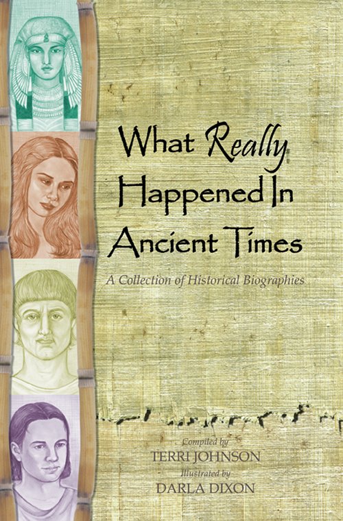
I have a pencil drawing that is a gooddemonstration of both - one of the baby's hands is realistic, but the
other one looks flat. I am very pleased with
most of this artwork,
but I really regret the way I drew that hand. I didn't do a lot of
highlighting of it, because I didn't want it to distract from the
sweet baby, but just because the drawing of the hand is weak, it
draws my attention every time now.
Like so many other things we try to draw, our
own mind can sometimes get in our way. If we concentrate so hard on
"I'm drawing fingers" or, "I'm drawing a hand," we put a lot of
pressure on ourselves to perform. Instead of thinking in terms that
stress us out, I think it helps a lot to think of them as simple
shapes...remember Lincoln Logs? Well fingers aren't
that perfectly
round shaped, but they're close. From knuckle to the joint is one
log, from that joint to the next joint is another little 'log,' and
from that joint to the end of the finger is yet another 'log.'
Think about the shapes - break the hand down into just simple shapes
so you will find it less intimidating.
Look for all the shadows and the opportunities to create a sense of
depth by taking advantage of the light and shadow. If you are working
from a photograph, turn the photo and your paper sideways, or even
upside down and work on it that way - it tricks your mind a little
bit, so you pay more attention to the shapes.
Look at drawings of hands by other artists so you will become more
familiar with different ways hands can be portrayed in art. Getting
the shapes right is the first step - after you have gotten to the
point of being more comfortable drawing hands, then you move on to
put in the fine details (fingeranils, age spots, wrinkles, veins).
You can also draw your own hand for practice. Here are some books
that can help you in greater detail to learn how to draw hands.
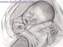
 A quick sketch I did last night in Micron pen based on a Mary Cassatt monotype called Peasant Mother and Child (circa 1894).