My website is not perfect, it's a work in progress...I do it myself and I am not a website designer. But over time, I have learned a lot. Here are some of the things that bug me about websites and make me leave really fast. I base what I do on my website by what I like to see in a website, so if you have some constructive comments about how I could make my
website better, I would love to hear them too. I would like my site visitors to stay a nice long time and enjoy looking at my art and hopefully ordering some of my artwork, without being annoyed.
Excessive underlining - Those sites that underline almost
every phrase. If you want to add emphasis to a phrase, please just put it in
bold or
italics. Underlining stuff just makes us think it's clickable...and then when some things are clickable and some are not, then we have to run the cursor over your entire webpage to figure out what to click on.
Contact links that go right into email. When I click on the words 'Contact Us' or 'Contact' on a site, I really prefer it to lead me to a page with their address and contact phone numbers and
then a clickable email link or a contact form. I hate it when it goes right to opening up email. I don't contact until I know
who you are and
where you are. I guess it doesn't matter really where you are, but I just like to know first.
Music - if I wanted music, I would have turned on the radio. Yes, Candle in the Wind
is a pretty song but I don't want to hear it in tinny midi format 5 times in a row.
Busy and dizzy - I can't stand sites that are gaudy and make my eyes hurt.
My MySpace.com page is a good example of that...it's awful I admit it. Probably the tackiest Internet page you'll look at today. The background is so busy it's hard to read the page. I would change it, but I am myself too busy.
Forms - when I fill out a form, I like it to bump me to a page that says the message was sent successfully. I hate it when I click Send and I end up on the same page with no message....leaves me wondering if it worked. It's not a nice feeling.
Payment - I like to have choices. I want several different payment options and payment processors from which to choose. I am very excited to be able to now offer Google Checkout on my site in addition to PayPal, personal checks, and money orders.
Flash-y - Sites that go on for 10 minutes with a grandiose Flash presentation. Some give the option to "Skip Intro".... they are the ones that take too long to get into the site to even figure out what the company
does. I feel like they are just trying wayyyy too hard to impress me.
Well that's all I can think about tonight. So if you wouldn't mind visiting my website and giving me a review, that would be great. Just use the Contact Form on my website to let me know what you think. Feel free to be brutal about whatever bugs you, and if I'm able to fix it, I will.
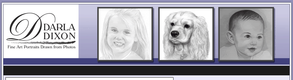
My site is
http://www.pencil-portrait-drawing-artist.com/We have been fighting some sickness this week.
Good news is, we got the tree up and it's beautiful!